I’m imagining it with better art.

It's a very short book. I like the concept, which is that the author took a story that was told by his highly imaginative preschool-aged son, and polished it up to make it into a full book.
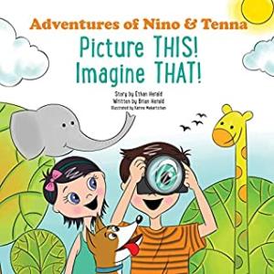
The story is this: basically, a boy takes his camera, and goes outside and takes a bunch of pictures and comes back and shows them to his sister and their dog. He says something like, 'Here's a picture of a bunny and they says, 'No, it's a cloud,' and he points out how the cloud looks like a bunny. All of his pictures were of something that he was imagining looked like something else, like a rock that looked like a turtle. Then the kids play around their house, pretending things like a lamp is a giraffe, and a couch is a bus, and they bounce around and pretend to be kangaroos. Then they imagine riding the bus to the library. And then they go on a car ride with their father and look out the windows, imagining the passing scenery looks like animals.
I'm not a fan of the style of the illustrations. I feel like they could have done a better job depicting the text. For example, in one picture it says, "She didn't just see tree branches. Now she saw tree branches that made the shape of a monkey hanging from a tree by its tail." But the artist draws all trees with long trunks that are almost too thin, and usually the foliage is just circles, like a child would make. I'm not sure how similar to a monkey it's supposed to look, but it's quite far off, meaning that the boy comes across as having an extremely wild imagination.
It's not a terribly compelling story, but I can see the good message behind it, about the power of imagination, and trying to see things from others' point of view. The story is followed by a page of questions that could prompt children to imagine things around their house, like "What can you do with a cardboard box before it's recycled?" And the second half of the book is copies of the illustrations from earlier in the book without color, so children can color them in. It comes across as the author not having enough material to make a longer book, and just putting some random things together to make an activity book out of it. I know that when publishing a book, it's hard to get the right number of pages (it's often exactly 32 because each piece of paper is folded in half to make 4 pages, both front and back, and 28 pages and shorter often feels too short).
The writing is decent. It's not high literature or anything, but there was nothing that jumped out at me about the writing, and that's a good thing, especially in self-published works.
My main gripe is the illustrations. I'm going to take a stance here and say they're just not very good. It comes across like the author either got a relative or friend to draw them who didn't have a lot of experience, or just didn't have enough money to pay for a decent illustrator, both of which are likely options in the world of self-publishing, but give it kind of an unfinished, low-budget look that's usually not desirable in a book. The stylized nature of the drawings make it seem almost surreal and not like something that actually could have happened, while the text is very matter-of-fact.